The year 2022 is quickly approaching, which means it’s time to start planning for the future! What will be trending in your industry? How can you optimize your website for next year? In this blog post, we’ll explore some of the top trends and best practices that will take over as 2021 comes to a close. 

Summary:

Why Optimizing Your Website is Important?

Tip 1: Dynamic Content & Interactivity

Tip 2: Dynamic Scrolling

Tip 3: Thumb Approved Capability

Tip 4: Dark Mode

Tip 5: Minimalism & Page Speed

Tip 6: Colour Influence

Tip 7: Accessibility

Tip 8: Local SEO

Why Optimizing Your Website is Important?

Website optimization is essential to a successful marketing strategy. An optimized website helps visitors find answers, solutions and information on the internet– Why not get the answers from You? A more effective site can increase revenue for your business through new leads or conversions while reducing client acquisition costs with high  conversion rates, and by providing clients with support whenever they need it.

Need Professional Help to Optimize your Website?

We Can Help!

Tip 1: Dynamic Content & Interactivity

Dynamic content (also known as smart content) has become well known in the past few years, by utilizing data-driven content, you can influence your consumers’ journey and increase conversions! Instapage reports personalized homepage promotions can influence 85% of consumers to convert and shopping cart recommendations influenced 92% of online consumers. By displaying different content to each visitor, depending on their past browsing behaviour or location can increase engagement and conversion rates. 

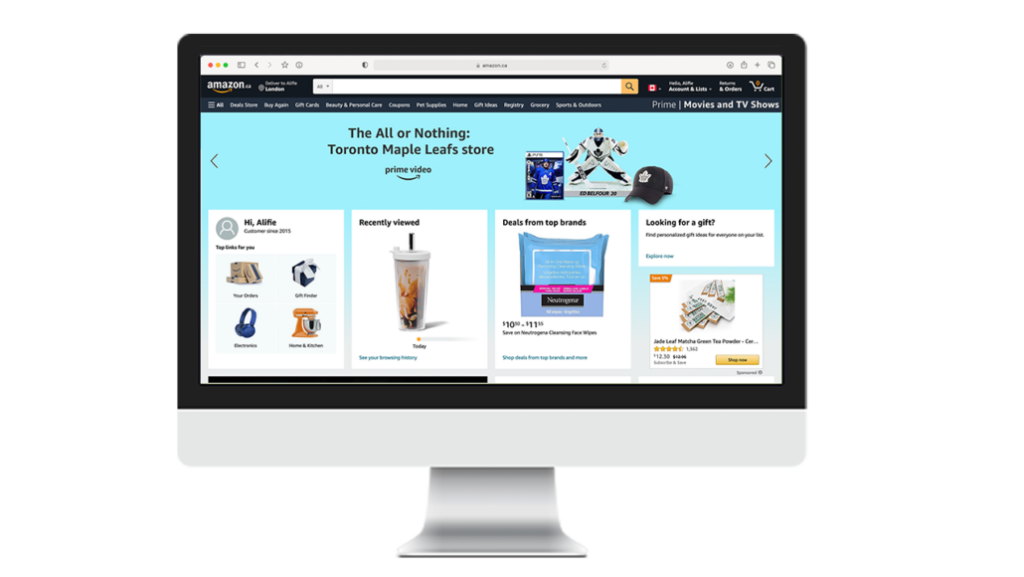
Additionally, including interactive content, you can tailor your website’s landing pages and user experience based on each individual visitor’s needs or behaviour. This can include chatbots or other AI machines that can predict what your consumer wants to purchase or find. The most well-known example of personalized and interactive content is Amazon. As shown below, Amazon creates customized recommendations after you have signed into their database. As you can see, Alifie can easily find recently viewed products and customized promotions and all above the fold!

Tip 2: Dynamic Scrolling

Dynamic scrolling is an innovative way of presenting your content that has been gaining momentum in recent years. It allows visitors the opportunity to view several web pages on one single page, which creates an immersive experience for them as they scroll down and discover new things about you! Not to mention its thumb-scrolling capabilities which will be discussed in the Thumb Approved Capability Section! By utilizing dynamic scrolling you can create a story with your website. Unlike static sites, which have one page that pans up or down depending on how far away from it someone is looking at any given moment in time – when using parallax scrolling all of these panning movements are happening simultaneously so there’s always something new for the viewer to see!

Tip 3: Thumb Approved Capability

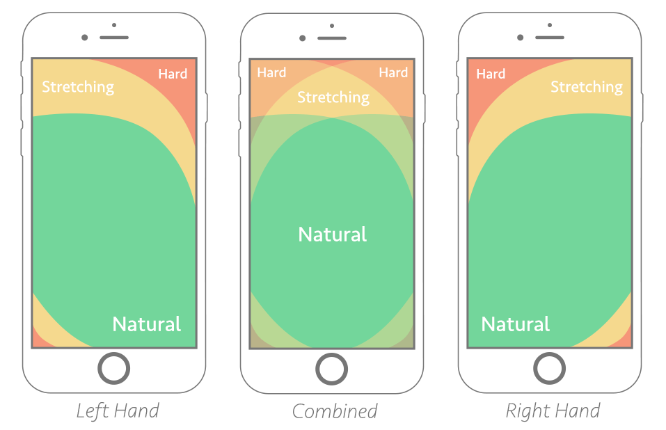
As discussed in our previous blog post, SEO Trends to Utilize when Optimizing your Marketing Strategy for 2022, mobile use is expanding! Statcounter reports, 57% of web users are using their mobile devices when surfing the web, meaning our websites need to be utilized for user experience for the thumb! As illustrated below, your thumb cannot always reach every corner of your phone screen easily so we must be designing our websites with this in mind! Designing your website where the most valuable content is in the green zone shown below can make a more enjoyable experience for the user! 

Image Source: Netlify

Need Professional Help to Optimize your Website?

We Can Help!

Tip 4: Dark Mode

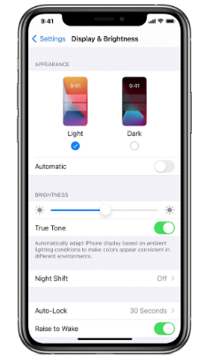
Dark mode is not a new trend however, it is becoming increasingly popular lately. Dark mode is a display setting that shows your content with a black background and light text in comparison to the traditional black text on a white background. Dark mode is a bit controversial as there are conflicting insights into the science behind the benefits of using the dark mode function. Some experts believe it’s easier and more beneficial for your eyes to read text on a dark background as it can reduce eye strain. However, some come to the opposite conclusion and believe it is healthier and more beneficial to read on a light background. Many companies and platforms give the option to their users for their default settings. For example, Apple or Facebook users have the option to use dark or light mode, as shown in the image to the right! For more information on the advantages and disadvantages of the Dark Mode function, check out Forbes article: What Is Dark Mode – And Should You Be Using It?

1 in 4 visitors

would abandon a website that takes more than 4 seconds to load

46% of users

dont’t revisit poorly performing websites

64% of shoppers

who are dissatisfied with their site visit will shop somewhere else next time

1 second delay

reduces customer satisfaction by 16%

Tip 6: Colour Influence

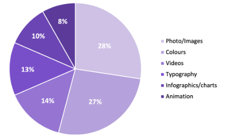
  1. Using a minimalist approach to your website design does not mean no colour! Colour evokes feeling and incites emotion, for this reason selecting the right colour for your personal branding efforts is especially important. Your colour choices can enhance your brand perception, however, the wrong colour could damage your brand image. Top Design Firms reports that 39% of consumers believe that colour is important to a brand’s website and as shown in the image to the right, when a study was conducted on what visual elements do consumers value on a company website colour was a close 2nd with 39%. To learn more about colour theory check out this great resource: 

What Visual Elements do Consumers
Value on Company Websites

Tip 7: Accessibility

The future is now! Virtual reality, voice search and other innovative technologies are revolutionizing the way we engage with our world. These accessibility trends have opened up new perspectives on what it means to be fully inclusive for all users – anyone can experience these features without having any disabilities or physical limitations that would make using traditional technology difficult (or impossible). To learn more details about new accessibility trends, take a look at our last blog post: SEO Trends to Utilize when Optimizing your Marketing Strategy for 2022.

Add a FAQ section to your website. 

You can make your website more accessible by adding a FAQ section. This will include questions and answers, which are read aloud in the same tone of voice as Google’s “Voice Search.” This offers an easy option that includes your question keywords and includes answers that can be read to the voice searcher easily! 

Write how you speak. 

Write content how you speak and add filler words to optimize your keywords into a smoother and more natural sentence or question. For example, instead of “Mt. Fuji climb supplies” you could add, “What supplies do I need for climbing Mt. Fuji?”

Don’t forget to add answers to your questions! 

Have you answered the question of “What do they want?” on your website. I’m sure there are some people who would argue with me, but if I were to teach an entire class about user behaviour, one thing we could all agree upon is that asking this simple query has immense value in helping us tailor our websites so visitors get what they came for and leave happy!

Tip 8: Local SEO

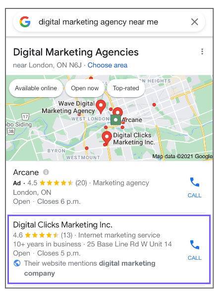
Local search engine optimization (SEO) is still holding strong! The search queries that include “near me” or “close by” have become increasingly popular with 46% of all Google searches looking for local information. Optimizing your SEO strategy to include keywords with “near me” is a simple way to rank higher on the search engine result pages (SERP).

Tip 8: Local SEO